Newsletter Sign-up Ideas
to Grow Your Email Lists
How to create a customer list via email? You need to attract people to your email lists first! Among thousand of methods out there, newsletter sign-up forms appear to be the simplest yet most workable solution.
The topic for discussion today centers on 11 effective newsletter sign-up tips to grow your email list.

Which Types of Sign-up Forms Should You Use?
Landing Page Forms
A landing page form refers to a page that contains only a form without any distraction elements on it, such as a sidebar, navigation menu, or other download links.


Inline Forms
Inline sign-up forms are the forms you embed into your webpage. It lets you place them anywhere on your sites, from within the body of your content, on the top, to at the bottom of your pages.
Popup Forms
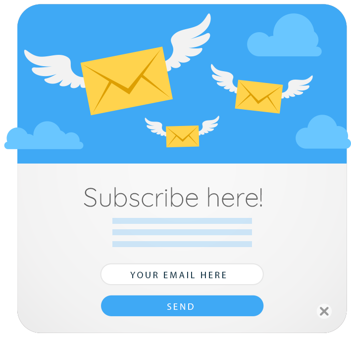
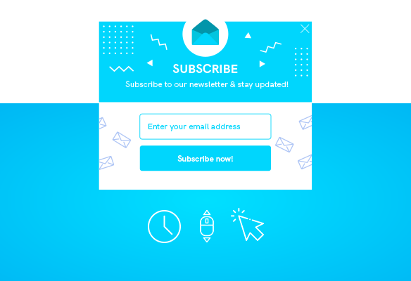
Popup forms are set up to appear at a certain point during user engagement on your site.
- Timed-delay popup lets your visitors view your content before showing up.
- Stroll-delayed popups appear after users spent a specific time scroll down your pages.
- Two-step popups show up after someone clicks a link or button on your page.
- Exit-intent pop-ups display when your potential leads are about to leave your site.

11 Effective Newsletter Sign-up Form Ideas to Rocket Your Email Lists
Give an Enticing Headline
An enticing headline that fully catches user attention as well as arousing interest in them. What’s more, it must be to the point by clearly indicating what you’re gonna offer to subscribers.


Clearly Point Out the Value
It’s necessary to attract users by completely communicating the benefits they’ll get in exchange for their emails.
Informing readers that by signing up, they’ll receive content value, such as great tips, discounts, and savings.

Utilize a Double Opt-in
Once visitors submit their email addresses via your newsletter sign-up forms, immediately they will receive a confirmation email.
Leads will need to assure their submission by clicking on the provided links or another CTA button attached in their inboxes.
Offer a Special “Subscribers Only” Incentive
Offering users exclusive access to certain kinds of content or deals, resources, and more will generate more opt-ins to your site.
Note: This tactic works for popup forms only.


Minimize Your Form Fields
The fewer your sign-up form fields are, the more likely your site will get a higher conversion rate. The ideal number of form fields should be one or a maximum of two
Showcase Social Proof
Similar to word of mouth, numbers also serve as a powerful tool to build trust and stimulate readers to sign-up. Publishing how many subscribers you have helps demonstrate the authority of your site.

Consider Signup Form Placement
Signup forms must be positioned in the most noticeable yet natural placement. This not only helps catch the user’s eyes but also smoothen their experience.
Several strategic spots that most marketers will choose to place sign-up forms are on top of the sidebar, top header, after a post, footer, or on the pop-up box.
Placing your sign-up forms in different positions, asking your friends, loyal users to test them to find out the best form position.


Use a Clear, Strong Call to Action
Placing the boring “Submit” or “Sign-up” word with a concise, jargon-free phrase with actionable verbs catching the reader's attention.
Following are some effective copywriting tips for newsletter sign-up CTA:
- Begin with verbs and subjects.
- Make sure the CTA is between 90 and 150 characters.
- Keep the copy less technical and more practical.
- Use personal or possessive language.
- Add some sense of urgency.

Write Conversational Copy
Conversational content will create a connection between site owners and readers. This leads to more opportunities to get your services and products off the ground.
Tips to write conversational copy
- Avoid writing to everyone by always targeting a single reader.
- Use a simple writing style with empathy in mind.
- Engage your readers with rhetorical questions.
- Shorten your sentences with commas.

Make Your Newsletter Sign-up Forms Mobile-Friendly
How to make your newsletter sign-up forms mobile-friendly?
Firstly, be aware of the mobile popup penalty.
Secondly, make submit buttons touchable. The smaller the touch targets are, the harder it is for users to finish their forms.
The ideal button size is around 60 px, with a bare minimum of 12 px spacing between the button and other clickable elements.

Add a Sense of Wit and Humor
Adding a sense of humor and sharp wit to sign-up forms will leave a vivid impression on your readers. This also contributes to shaping trust and increasing user engagement on your site.